RedKalion
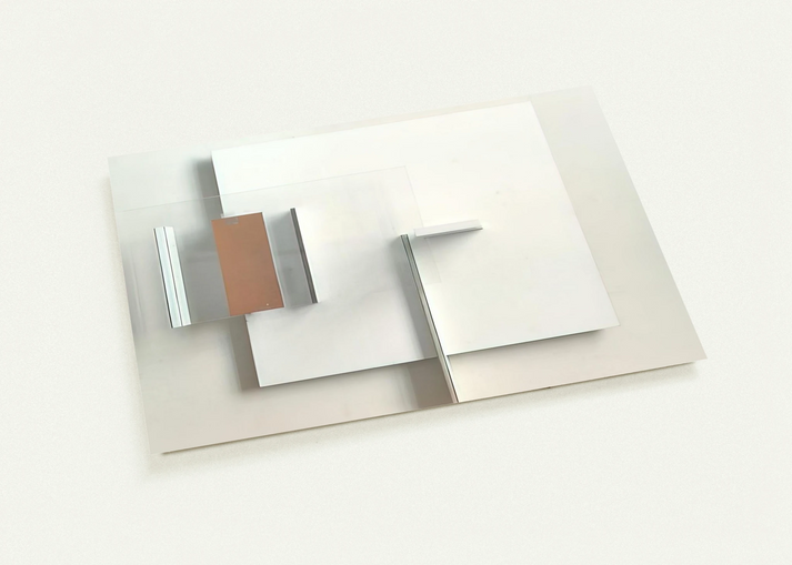
Abstract in White, Black and Ochre - 1962 By Victor Pasmore Pack of 10 Post Cards | Victor Pasmore Post Cards | A6 (10.5 x 14.8 cm) - 4.1 x 5.8 inches
Abstract in White, Black and Ochre - 1962 By Victor Pasmore Pack of 10 Post Cards | Victor Pasmore Post Cards | A6 (10.5 x 14.8 cm) - 4.1 x 5.8 inches
No se pudo cargar la disponibilidad de retiro
Elevate Your Collection with Victor Pasmore’s Abstract Mastery
Experience the sophisticated spatial dynamics of British Constructivism with this pack of 10 museum-quality postcards featuring Abstract in White, Black and Ochre (1962) by the renowned artist Victor Pasmore. As a pioneer who led the transition from representational landscapes to pure abstraction in Britain, Pasmore’s 1962 work is a masterclass in balance, utilizing rhythmic lines and organic forms to define a new visual language.
At RedKalion, we bridge the gap between historical art and modern print excellence. These postcards are not merely stationery; they are miniature archival reproductions. By employing 12-color fine art printing technology, we capture the profound depth of Pasmore’s ochre tones and the stark precision of his black lines with a fidelity that standard 4-color inkjet processes simply cannot replicate.
Superior Craftsmanship for the Discerning Curator
Each card is printed on 200 gsm (80 lb) FSC-certified paper, ensuring a substantial feel and a commitment to environmental sustainability. The smooth matte finish provides a clean, glare-free aesthetic, making these cards perfect for framing as a curated set or sending a distinguished sentiment to a fellow art lover.
- Historical Significance: A definitive example of Pasmore’s post-war constructivist era.
- Archival Quality: 12-color depth on 0.26 mm thick premium cardstock.
- Sustainable Luxury: Printed on demand using eco-conscious materials.
- Versatile Display: A6 dimensions (10.5 x 14.8 cm) ideal for small-space decor or high-end correspondence.

Discover Unlimited Art Possibilities
At RedKalion, you can find virtually any artwork from any artist, available in a wide range of sizes to perfectly match your space.
If you didn’t find what you’re looking for, contact us at support@redkalion.com . We will source any artwork and produce it in any size and format you need, including art prints, posters, canvas, framed pieces, framed canvas, and more.
For dedicated art enthusiasts, we also offer handcrafted replicas of any artwork, carefully painted by highly skilled artists using traditional techniques.
For custom requests, contact us at support@redkalion.com .
What makes these Victor Pasmore postcards museum-quality?
Unlike standard prints, RedKalion uses 12-color fine art printing. This delivers superior color vibrancy and accuracy, capturing the nuanced ochre and deep blacks of Pasmore’s original 1962 abstract composition with stunning archival depth.
What is the weight and finish of the paper?
The postcards are printed on 200 gsm (80 lb) paper with a thickness of 0.26 mm. They feature a smooth matte finish, ensuring a glare-free display and a premium, professional hand-feel.
Are these prints environmentally sustainable?
Yes. We use FSC-certified paper, which ensures the materials are sourced from responsibly managed forests. Additionally, our print-on-demand model reduces waste by eliminating excess inventory.
How does the 12-color printing differ from standard prints?
Standard printing uses four colors (CMYK), which can flatten complex artworks. Our 12-color technology provides a broader color gamut, resulting in smoother gradients and more precise detail for fine art reproductions.
Can I purchase these cards without a minimum order requirement?
Absolutely. While this product comes as a curated pack of 10, all RedKalion prints are produced on demand with no minimum order constraints, ensuring high quality for every individual set.
What was Victor Pasmore’s artistic focus in 1962?
By 1962, Pasmore was deeply immersed in British Constructivism. His work focused on the relationship between geometric structure and organic rhythm, moving away from traditional representation to explore how shapes interact within a defined space.
Why are the colors White, Black, and Ochre significant in this work?
This palette represents Pasmore’s shift toward elemental colors. The ochre provides a grounded, earthy warmth that contrasts with the stark, intellectual nature of the black and white, creating a balanced, timeless aesthetic.