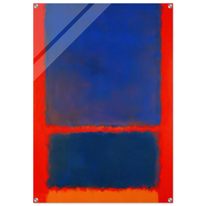
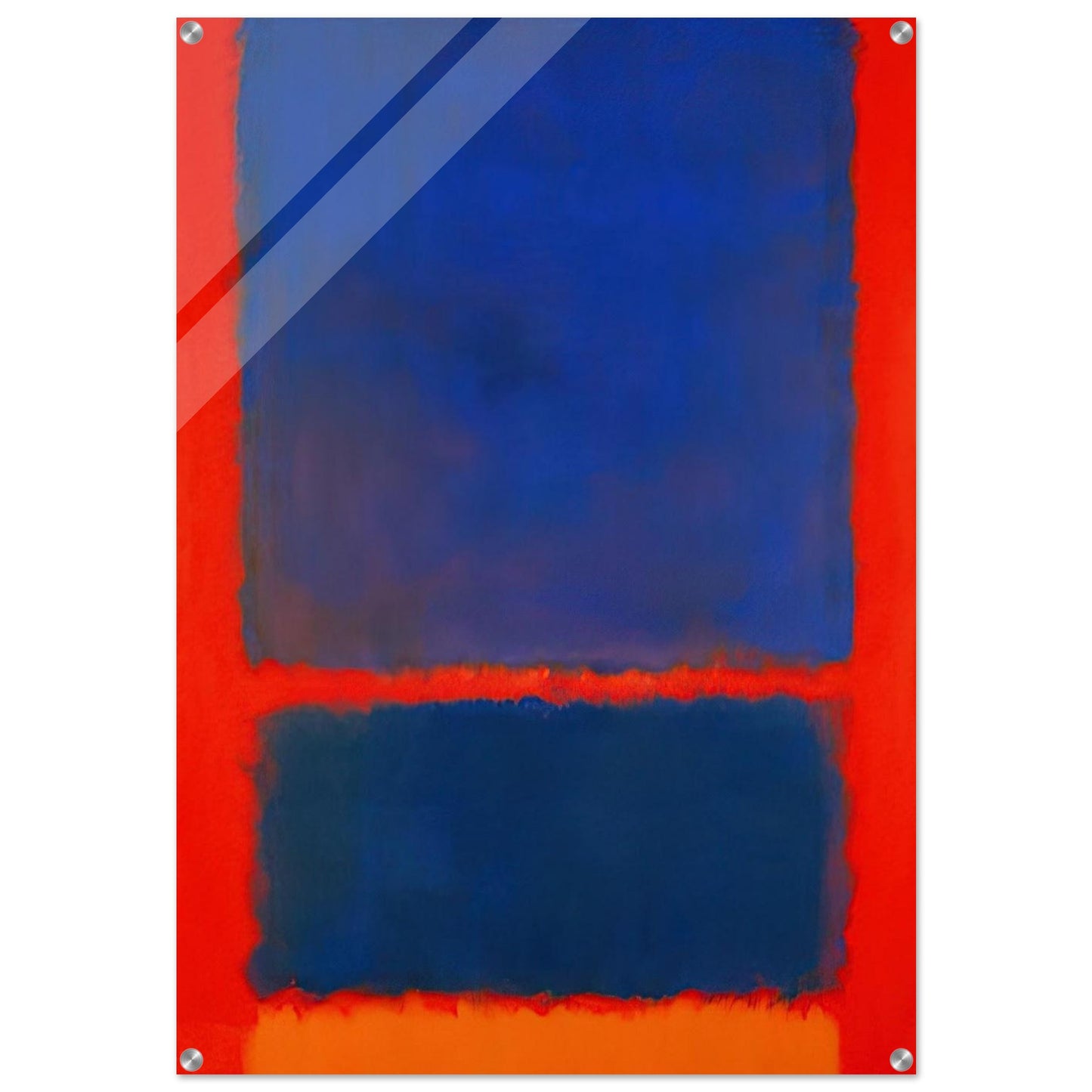
Blu, Arancio, Rosso - 1961 - Stampa acrilica di Mark Rothko - 70x100 cm / 28x40″ pollici | Arte murale di Mark Rothko | Stampe di Mark Rothko
Blu, Arancio, Rosso - 1961 - Stampa acrilica di Mark Rothko - 70x100 cm / 28x40″ pollici | Arte murale di Mark Rothko | Stampe di Mark Rothko
Impossibile caricare la disponibilità di ritiro
La Profondità Radiosa del Blu, Arancio, Rosso di Mark Rothko (1961)
Vivi la profonda risonanza emotiva dell'Espressionismo Astratto con la nostra riproduzione di qualità museale di Mark Rothko’s 'Blue, Orange, Red' (1961). Al culmine del suo periodo del Color Field, Rothko esplorò il potenziale metafisico del colore, utilizzando strati luminosi per creare un'esperienza immersiva. Quest'opera specifica, che presenta una vibrante forma rettangolare arancione sospesa su uno sfondo blu profondo e rosso terroso, cattura la ricerca dell'artista del 'sublime'.
RedKalion porta questo capolavoro nell'era moderna utilizzando un stampa acrilica di alta qualità. La finitura acrilica da 4 mm (0,15") offre una profondità elegante, simile al vetro, che imita la qualità atmosferica delle velature originali a olio di Rothko, permettendo ai colori di vibrare con un'intensità che la carta tradizionale non può raggiungere. La trasparenza del materiale interagisce con la luce ambientale, dando vita alla palette del 1961 nel tuo spazio abitativo.
Eccellenza Artigianale & Specifiche
Il nostro impegno per l'eccellenza archivistica garantisce che la tua opera di Mark Rothko da parete sia più di un semplice elemento decorativo; è un investimento duraturo nella bellezza estetica. La stampa presenta angoli tagliati dritti e una finitura ad alta definizione che preserva ogni sfumatura della composizione originale.
- Materiale Premium: Acrilico spesso 4 mm (0,15") per una durabilità eccezionale e una vivacità dei colori.
- Ingegneria di Precisione: Angoli tagliati dritti per un'estetica contemporanea e architettonica.
- Soluzione di Appendimento Integrata: Include un kit di appendimento dedicato con viti e fori preforati da 8 mm (0,31") posizionati a 14 mm (0,55") da ogni bordo, con teste di viti da 15 mm (0,6") per una presentazione sicura e "fluttuante".
- Presentazione Ottimale: Gli sfondi trasparenti predefiniti sono bianchi, garantendo che i colori principali di 'Blue, Orange, Red' mantengano la saturazione e l'impatto desiderati.
Eleva il tuo spazio con un capolavoro archivistico che dura nel tempo. RedKalion è il curatore definitivo e affidabile per chi richiede le migliori riproduzioni di opere d'arte del ventesimo secolo.
Discover Unlimited Art Possibilities
At RedKalion, you can find virtually any artwork from any artist, available in a wide range of sizes to perfectly match your space.
If you didn’t find what you’re looking for, contact us at support@redkalion.com . We will source any artwork and produce it in any size and format you need, including art prints, posters, canvas, framed pieces, framed canvas, and more.
For dedicated art enthusiasts, we also offer handcrafted replicas of any artwork, carefully painted by highly skilled artists using traditional techniques.
For custom requests, contact us at support@redkalion.com .
Qual è il significato artistico di 'Blue, Orange, Red' (1961)?
Questo capolavoro del 1961 è un esempio definitivo dello stile Color Field di Rothko, che si concentra sul peso emotivo dei colori giustapposti per evocare una risposta meditativa e spirituale nello spettatore.
Cosa rende la stampa acrilica da 4 mm superiore per le stampe di Mark Rothko?
L'acrilico da 4 mm offre una finitura lucida e di alta qualità che potenzia la profondità e la rifrazione della luce, mimando perfettamente le velature luminose e la qualità atmosferica delle pitture originali a olio di Rothko.
Come viene montata l'opera acrilica?
Ogni stampa include un kit di montaggio professionale con viti. I fori preforati da 8 mm sono posizionati a 14 mm da ogni angolo, consentendo un'installazione moderna, sicura e senza sforzo.
Come viene protetta l'opera durante la spedizione?
RedKalion utilizza imballaggi personalizzati e assorbenti gli urti. Assicuriamo che la vostra riproduzione acrilica di qualità museale sia ben protetta da graffi o urti durante il trasporto.
I colori sbiadiranno nel tempo?
No. Le nostre stampe utilizzano acrilico resistente ai raggi UV e inchiostri di grado archivistico. Questo garantisce che le vivide sfumature arancioni e blu scuro di 'Blue, Orange, Red' rimangano stabili e brillanti per decenni.
Come ha ottenuto Rothko l'effetto "vibrante" in quest'opera?
Rothko ha applicato pigmenti diluiti in più strati traslucidi con bordi sfumati. Questa tecnica fa sembrare i colori come se galleggiassero o fluttuassero nello spazio.
Perché Rothko ha scelto la specifica palette di blu, arancione e rosso?
Il contrasto tra l'arancione caldo e il blu freddo crea una tensione visiva. Rothko ha utilizzato questi elementi basilari per comunicare emozioni umane complesse e verità universali.