제품 정보로 건너뛰기
1 1

RedKalion

Blue Orange Red - 1961 - Mark Rothko 70x100 cm / 28x40 inches Framed Art Print – Black Wooden Frame

Blue Orange Red - 1961 - Mark Rothko 70x100 cm / 28x40 inches Framed Art Print – Black Wooden Frame

정가 $449.99 USD
정가 $999.99 USD 할인가 $449.99 USD
할인 품절
수량

Immerse Yourself in the Luminous Depth of Mark Rothko’s Blue, Orange, Red (1961)

Step into the profound emotional landscape of Mark Rothko’s Blue, Orange, Red (1961), a definitive masterpiece of the Color Field movement. This 70x100 cm framed art print captures the ethereal glow and vibrating boundaries that defined Rothko's late period. Rather than depicting a subject, Rothko uses horizontal bands of saturated color to evoke a sense of the sublime, inviting the viewer into a state of quiet contemplation. At RedKalion, we meticulously reproduce this iconic work to ensure the subtle tonal shifts and deep pigments remain as impactful as the original canvas.

Museum-Grade Materials and Archival Quality

Our commitment to excellence ensures that your investment in fine art is protected for generations. This reproduction is printed on 250 gsm (110 lb) archival museum-quality paper. The paper is natural white, uncoated, and features a matte finish that prevents glare, allowing the deep oranges and resonant blues to breathe naturally. To maintain the highest standards of sustainability, we utilize FSC-certified materials, ensuring your art choice is as ethical as it is beautiful.

Exquisite Framing and Craftsmanship

Every print is housed in a premium black wooden frame crafted from responsibly sourced oak and ash. With a robust 20mm (0.79") profile, our frames offer more architectural presence than standard 14mm gallery frames. The artwork is shielded by shatterproof plexiglass, providing crystal-clear visibility while offering superior protection against the elements. Your Mark Rothko masterpiece arrives ready-to-hang with a professional hanging kit included, allowing you to elevate your space the moment it arrives.

  • Artist: Mark Rothko (1903–1970)
  • Title: Blue, Orange, Red (1961)
  • Paper: 250 gsm archival matte finish
  • Frame: 20mm black solid wood (Oak/Ash)
  • Dimensions: 70x100 cm / 28x40 inches

Transform your interior with a piece that transcends decoration. This RedKalion archival print is more than a reproduction; it is an invitation to experience the emotional gravity of one of the 20th century’s most influential artists.

전체 세부 정보 보기
What makes this Rothko print museum-quality?

We use 250 gsm archival-grade, natural white paper with a matte finish. This ensures the heavy pigment load of the Rothko reproduction remains vibrant without fading, meeting the standards of fine art galleries and museums for longevity and texture.

Is the frame sustainably sourced?

Yes. All frames at RedKalion are crafted from FSC-certified oak and ash wood. This guarantees that the timber is harvested from responsibly managed forests, providing an eco-friendly way to display your fine art print.

What are the exact dimensions and frame thickness?

The print is 70x100 cm (28x40 inches). The frame features a premium 20mm (0.79") width and thickness, which is sturdier and more visually impactful than the thin 14mm frames commonly found in retail shops.

How is the artwork protected from damage?

Each framed print is fitted with high-quality shatterproof plexiglass. This material is lighter and stronger than traditional glass, protecting your Rothko print from impact and UV-related degradation while maintaining perfect clarity.

Does the print arrive ready to hang?

Absolutely. Your framed Mark Rothko print arrives fully assembled with a hanging kit included. It is designed to be hung directly on your wall immediately upon delivery, with no additional hardware required.

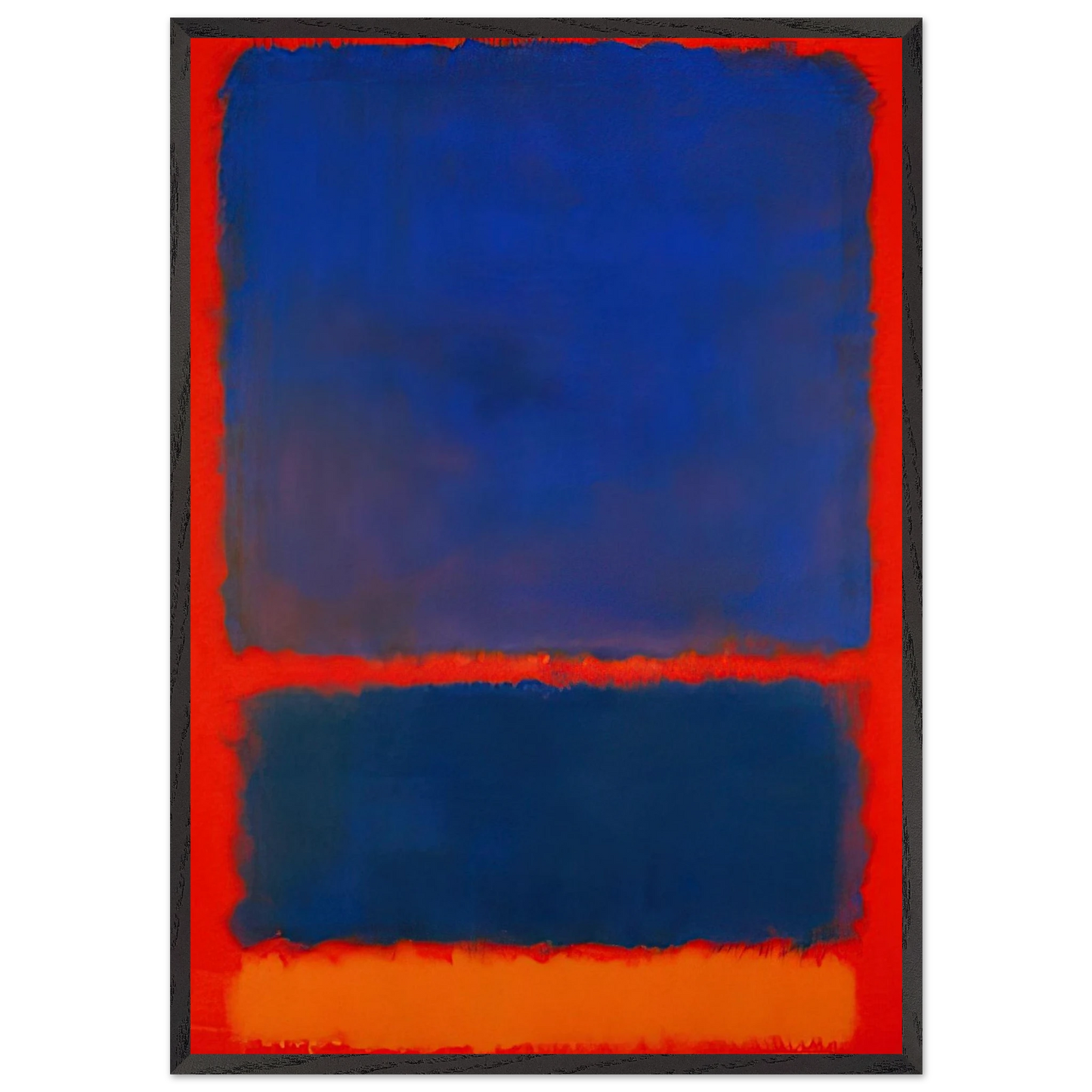
What is the significance of Blue, Orange, Red in Rothko's 1961 period?

By 1961, Rothko had perfected his "multiform" style. This piece represents his mastery of light and color interaction, where the floating rectangles appear to hover in space, creating a meditative, spiritual experience for the viewer.

Why did Rothko choose these specific color stacks?

Rothko used color as a vehicle for basic human emotions—tragedy, ecstasy, and doom. The contrast between the cool blue and the fiery oranges and reds in this 1961 work creates a visual tension meant to provoke a visceral reaction.