


Discover Unlimited Art Possibilities
At RedKalion, you can find virtually any artwork from any artist, available in a wide range of sizes to perfectly match your space.
If you didn’t find what you’re looking for, contact us at support@redkalion.com . We will source any artwork and produce it in any size and format you need, including art prints, posters, canvas, framed pieces, framed canvas, and more.
For dedicated art enthusiasts, we also offer handcrafted replicas of any artwork, carefully painted by highly skilled artists using traditional techniques.
For custom requests, contact us at support@redkalion.com .
What makes the brushed aluminum finish unique for this Rothko print?
The brushed silver Aluminum DIBOND® features a horizontal grain that creates a metallic, dynamic look. White or unprinted areas in the design reveal the silver surface, giving the Rothko color fields a modern, shimmering depth not found on traditional canvas.
How is the print quality preserved over time?
We use direct UV printing on a 3mm rigid base. This method ensures high color saturation and a matte, glare-free finish that is resistant to fading, making it an archival-grade choice for serious art collectors.
Is the mounting hardware included with the print?
Yes, every Mark Rothko aluminum print from RedKalion comes with a hanging kit included. The specific type of kit varies depending on the fulfillment country to ensure the safest and most aesthetic display possible.
What are the exact dimensions and thickness of this piece?
This specific reproduction measures 70x100 cm (28x40 inches) with a thickness of 3mm (0.12"). This profile provides a substantial, premium feel while remaining sleek and modern on the wall.
Is the finish glossy or matte?
The finish is matte and glare-free. This is ideal for Rothko’s darker 1960 palette, as it prevents light reflections from distracting the viewer, allowing the deep siennas and purples to resonate fully.
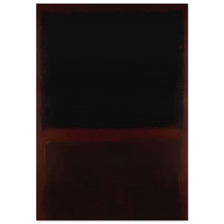
What is the historical significance of the 1960 color palette?
In 1960, Rothko’s work became increasingly dark and contemplative. This piece reflects his interest in 'the tragedy, ecstasy, and doom' of human existence, utilizing dark sienna and purple to create a profound emotional resonance.
Why did Rothko use dark sienna and purple in this work?
Rothko used these deep, overlapping tones to create a sense of 'breatheable' space. The sienna and purple interact to form a threshold, inviting the viewer into a meditative state and a deeper psychological experience.