
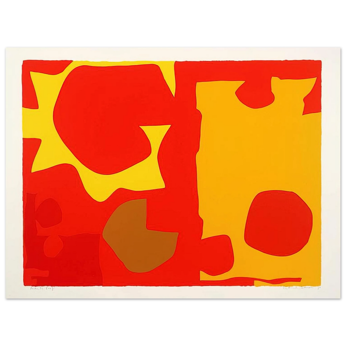
What is the historical significance of Patrick Heron's Six in Light Orange with Red in Yellow?
Created in 1970, this artwork reflects Patrick Heron's key role in the St Ives School, showcasing his abstract use of color and geometric forms to explore light and space in post-war British art.
How does the color composition in this artwork evoke mood?
The interplay of light orange, red, and yellow creates a vibrant, energetic atmosphere, with Heron's layered technique adding depth and a sense of luminous tranquility to the modernist piece.
What are the specifications of the Master's Edition archival paper used for this fine art print?
This museum-quality reproduction uses acid-free paper (pH above 7) with a matte, uncoated finish on natural white, weighing 250 gsm (110 lb) and 0.29 mm (11.4 mils) thick for durability.
How is this print shipped and what are the fulfillment options?
Printed on demand with no minimum orders, it is shipped securely to ensure your archival masterpiece arrives ready for framing, with sustainable FSC-certified paper.
What makes this reproduction archival and long-lasting?
The acid-free composition prevents yellowing over time, and the 250 gsm weight ensures this museum-quality print endures as a premium addition to your art collection.
What inspired Patrick Heron's use of geometric shapes in this 1970 piece?
Heron was influenced by European modernism and his surroundings in St Ives, using geometric abstraction to translate natural light and coastal landscapes into bold, color-focused compositions.
How does the matte finish enhance the viewing experience of this artwork?
The matte, uncoated finish on natural white paper reduces glare, allowing the vibrant colors and textures of Heron's work to be appreciated without distraction, adding a luxurious tactile quality.