RedKalion
180 COLORS - Gerhard Richter Acrylic Print - 70x100 cm / 28x40″ inches | Gerhard Richter Wall Art | Gerhard Richter Prints
180 COLORS - Gerhard Richter Acrylic Print - 70x100 cm / 28x40″ inches | Gerhard Richter Wall Art | Gerhard Richter Prints
Couldn't load pickup availability
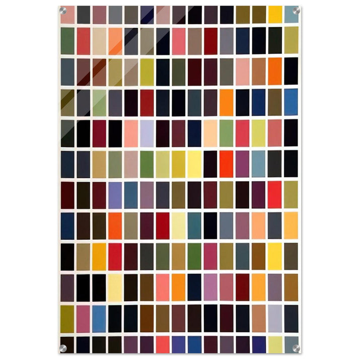
The Radiance of Systematic Abstraction: 180 COLORS by Gerhard Richter
Experience the mesmerizing interplay of structure and hue with 180 COLORS, a definitive masterwork by the legendary contemporary artist Gerhard Richter. Originally conceived in the late 1960s as part of his groundbreaking Farbfelder (Color Fields) series, this Gerhard Richter wall art represents a radical departure from traditional painting, where the artist used industrial color charts as his inspiration. This museum-quality reproduction captures the precise mathematical beauty and chromatic depth of the original, serving as both a historical statement and a vibrant modern centerpiece.
At RedKalion, we believe such an influential piece deserves a medium that enhances its inherent luminosity. Our Gerhard Richter prints are produced as premium acrylic prints, a material that perfectly complements the industrial aesthetic Richter sought to explore. The 4mm (0.15") acrylic surface adds a profound sense of depth and brilliance, making each of the 180 individual color cells pop with incredible clarity and saturation.
Archival Quality and Modern Sophistication
RedKalion is the definitive curator for fine art prints that bridge the gap between historical significance and contemporary interior design. This 180 COLORS reproduction is crafted to endure, using archival-grade materials that ensure the integrity of the palette remains unchanged for decades. The sleek, straight-cut corners provide a minimalist silhouette that integrates seamlessly into any sophisticated space, from private libraries to modern living areas.
- Material Excellence: 4mm (0.15") thick acrylic for a sleek, vibrant, and glass-like finish that resists the elements.
- Mounting Hardware Included: Every print comes with a dedicated hanging kit, including screws and hardware. Pre-drilled holes are located 14mm (0.55") from each corner for a secure, professional fit.
- Optimal Visual Clarity: While the acrylic is transparent, backgrounds default to white to maintain the specific chromatic balance intended by Richter.
- Durable Construction: High-quality materials designed for longevity, providing a timeless investment for your art collection.
Elevate your space with an archival masterpiece that endures. This Gerhard Richter acrylic print is more than decoration; it is an exploration of color theory and chance, curated for those who appreciate the evolution of modern art.

Discover Unlimited Art Possibilities
At RedKalion, you can find virtually any artwork from any artist, available in a wide range of sizes to perfectly match your space.
If you didn’t find what you’re looking for, contact us at support@redkalion.com . We will source any artwork and produce it in any size and format you need, including art prints, posters, canvas, framed pieces, framed canvas, and more.
For dedicated art enthusiasts, we also offer handcrafted replicas of any artwork, carefully painted by highly skilled artists using traditional techniques.
For custom requests, contact us at support@redkalion.com .
What material is used for the 180 COLORS print?
This Gerhard Richter print is crafted from 4mm (0.15") premium acrylic, which provides a sleek, vibrant, and durable finish that enhances the depth of the 180 colors.
How do I install this acrylic wall art?
Each print includes a full hanging kit with screws. It features pre-drilled holes at each corner, 14mm (0.55") from the edge, with an 8mm (0.31") diameter hole.
Is the background of the print transparent?
No, transparent backgrounds default to white. This ensures the 180 COLORS palette remains vivid and perfectly balanced against a clean, neutral backdrop as intended by the artist.
How is the artwork shipped to ensure it doesn't break?
RedKalion uses high-durability, secure packaging specifically designed for acrylic prints. We guarantee your museum-quality reproduction will arrive in pristine condition, ready for display.
Will the colors of my Richter print fade over time?
Our prints use archival-grade inks and UV-resistant acrylic. This combination protects the artwork from light damage, ensuring the colors remain as vibrant as the day they were printed.
What is the significance of the 180 COLORS arrangement?
Richter's 180 COLORS (1971) explores the objective nature of color. By using a systematic grid, he removed the artist's subjective choice, allowing color to exist as its own entity.
Why did Gerhard Richter use color charts in his work?
Richter was fascinated by the lack of emotion in industrial color charts. He used them to create 'non-composed' art, challenging traditional ideas of what a painting should be.