
RedKalion
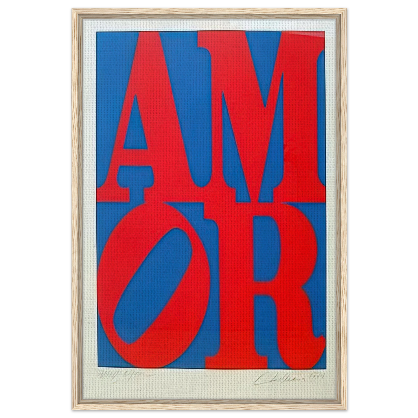
Amor - Robert Indiana Framed Canvas Print - 60x90 cm / 24x36″ inches
Amor - Robert Indiana Framed Canvas Print - 60x90 cm / 24x36″ inches
Couldn't load pickup availability
Universal Connection Through Robert Indiana's 'Amor'
Celebrate the enduring legacy of Pop Art with the iconic Amor - Robert Indiana Framed Canvas Print. While the 1970s 'LOVE' design remains a global symbol of peace and affection, 'Amor' represents Indiana's thoughtful expansion into linguistic and cultural bridges. This piece captures the same striking stacked typography and the signature tilted 'O,' but translated into Spanish, offering a warm, rhythmic energy that resonates across borders. This 60x90 cm (24x36″) reproduction brings the bold geometry and vibrant color theory of the American Pop Art movement directly into your curated space.
Museum-Quality Reproduction & Fine Art Craftsmanship
At RedKalion, we bridge the gap between historic significance and contemporary interior design. Our reproductions are not merely prints; they are archival-grade investments. Each canvas is a heavy-duty 300-350gsm cotton-polyester blend, ensuring a professional texture and weight that prevents sagging over time. The 350-400 micron thickness ensures a robust surface that beautifully holds the saturated pigments characteristic of Indiana’s hard-edge style.
Sustainable Elegance: The Floating Frame
To elevate this masterpiece, we utilize a sophisticated floating frame design. The canvas is set with a precise 12 mm (0.45") gap, creating a visual depth that draws the eye toward the artwork. Our frames are constructed from FSC-certified wood—primarily poplar or pine—ensuring that your appreciation for art aligns with a commitment to the environment. The frame width is a sleek 9 to 14 mm, with a depth of 42 mm (1.65") in North America and 32 mm (1.26") in Europe, providing a substantial, gallery-ready profile.
- Archival Longevity: High-quality printing processes ensure colors remain vibrant for decades without fading.
- Ready to Hang: Each piece arrives with a country-specific hanging kit for effortless installation.
- Eco-Conscious Choice: Sustainably sourced wood and locally manufactured components reduce our carbon footprint.
- Global Sophistication: A definitive statement piece for collectors who value modern art history and premium materials.
Discover Unlimited Art Possibilities
At RedKalion, you can find virtually any artwork from any artist, available in a wide range of sizes to perfectly match your space.
If you didn’t find what you’re looking for, contact us at support@redkalion.com . We will source any artwork and produce it in any size and format you need, including art prints, posters, canvas, framed pieces, framed canvas, and more.
For dedicated art enthusiasts, we also offer handcrafted replicas of any artwork, carefully painted by highly skilled artists using traditional techniques.
For custom requests, contact us at support@redkalion.com .
What materials are used for the canvas and frame?
We use a 300-350gsm cotton-polyester blend canvas for durability. The frames are made from FSC-certified wood (poplar or pine), ensuring high-quality, sustainable fine art prints that resist warping over time.
How does the floating frame design enhance the artwork?
The floating frame features a 12 mm (0.45") gap between the canvas and the wood, creating a shadow-box effect that highlights the artwork's edges and provides a modern, gallery-quality presentation.
Is the hanging hardware included with the print?
Yes, every RedKalion framed canvas includes a specialized hanging kit. The hardware varies slightly by region to ensure the best fit for local wall-mounting standards, making it ready to display immediately.
Will the colors of the Robert Indiana 'Amor' print fade over time?
No. We utilize archival-grade, high-quality printing techniques and premium materials designed to maintain color vibrancy and prevent yellowing, ensuring your museum-quality reproduction lasts for generations.
How are the dimensions and frame thickness determined?
The print is 60x90 cm. The frame thickness is 42 mm (1.65") in North America and 32 mm (1.26") in Europe, optimized for regional architectural standards and structural integrity.
What is the historical significance of Robert Indiana’s 'Amor'?
'Amor' was created as a linguistic variation of his 1960s 'LOVE' motif. It debuted as a public sculpture in the late 1990s, symbolizing a bridge between English and Spanish-speaking cultures through the universal language of art.
Why is the letter 'O' tilted in this composition?
Indiana tilted the 'O' to create dynamic tension and a sense of playfulness within the rigid grid of the letters. It is a hallmark of his typographic style, meant to evoke movement and emotional resonance.