
RedKalion
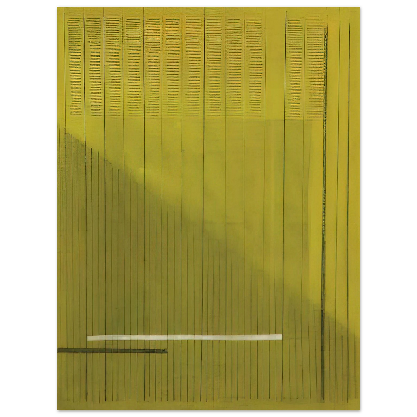
Bice Lazzari - Grigio Giallo Gray and Yellow - 1966 75x100 cm / 30x40inches Fine Art Poster
Bice Lazzari - Grigio Giallo Gray and Yellow - 1966 75x100 cm / 30x40inches Fine Art Poster
Couldn't load pickup availability
Elevate Your Space with Bice Lazzari’s Lyrical Abstraction
Experience the profound simplicity of Bice Lazzari’s 'Grigio Giallo' (Gray and Yellow), 1966. This exquisite fine art print captures a pivotal moment in the career of the 'Lady of Italian Abstraction.' In this 1966 masterpiece, Lazzari explores the rhythmic relationship between muted grays and vibrant yellows, utilizing a minimal yet deeply expressive vocabulary of lines and color fields. This 75x100 cm museum-quality reproduction allows the viewer to appreciate the structural poetry and balanced composition that defined Lazzari’s mid-century aesthetic.
Museum-Quality Execution for the Discerning Collector
At RedKalion, we believe that great art deserves an equally exceptional medium. This reproduction is crafted on our Master's Edition archival paper, a 250 gsm (110 lb) natural white, off-white substrate. The uncoated, matte finish eliminates glare, allowing the subtle nuances of Lazzari's chromatic choices to resonate in any lighting condition. Because the paper is acid-free (pH above 7), your investment is protected against yellowing, ensuring the archival integrity of the print for decades to come.
Expertise and Craftsmanship
Bice Lazzari was renowned for her ability to translate psychological states into geometric forms. 'Grigio Giallo' is a testament to her 'poetry of signs'—a technique where every line serves as a rhythmic pulse on the canvas. Our commitment to FSC-certified materials and precision printing ensures that every 30x40 inch poster honors the artist's original vision while meeting the highest standards of sustainable, modern luxury.
- Artist: Bice Lazzari (1966)
- Paper: 250 gsm Archival Master's Edition
- Finish: Luxurious Matte, Uncoated Texture
- Sustainability: FSC-certified, acid-free paper
- Durability: Museum-grade longevity for heirloom quality
Discover Unlimited Art Possibilities
At RedKalion, you can find virtually any artwork from any artist, available in a wide range of sizes to perfectly match your space.
If you didn’t find what you’re looking for, contact us at support@redkalion.com . We will source any artwork and produce it in any size and format you need, including art prints, posters, canvas, framed pieces, framed canvas, and more.
For dedicated art enthusiasts, we also offer handcrafted replicas of any artwork, carefully painted by highly skilled artists using traditional techniques.
For custom requests, contact us at support@redkalion.com .
What makes the paper quality 'Master's Edition'?
Our Master's Edition paper is a 250 gsm (110 lb) archival-grade substrate. It features a natural white, uncoated finish that provides a luxurious, glare-free texture specifically designed for premium fine art reproductions.
Is this print archival-grade for long-term display?
Yes. The paper is acid-free with a pH value above 7, which prevents yellowing and degradation over time. This museum-quality standard ensures the artwork remains vibrant for generations.
What is the texture and finish of the Grigio Giallo poster?
The print features a sophisticated matte finish on an off-white paper. This provides a tactile, high-end feel and ensures there are no reflections, highlighting the subtle gray and yellow tones of Lazzari's work.
How are orders fulfilled and shipped?
At RedKalion, we utilize a print-on-demand model with no minimum orders. Each piece is carefully printed and shipped in protective packaging to ensure it arrives in pristine, museum-ready condition.
Is the paper used for this print environmentally friendly?
Sustainability is a core value at RedKalion. We use FSC-certified paper, ensuring that the materials for your Bice Lazzari print are sourced from responsibly managed forests.
Who was Bice Lazzari and what is the significance of 'Grigio Giallo'?
Bice Lazzari was a pioneer of Italian abstract art. 'Grigio Giallo' (1966) represents her transition toward 'Informalism,' where she used minimalist lines and color to create a rhythmic, visual language often compared to music.
What does the 1966 color palette represent in Lazzari's career?
By 1966, Lazzari moved away from dense materials toward a 'poetry of signs.' The gray and yellow palette exemplifies her mastery of structural balance, using color to define space rather than just fill it.