RedKalion
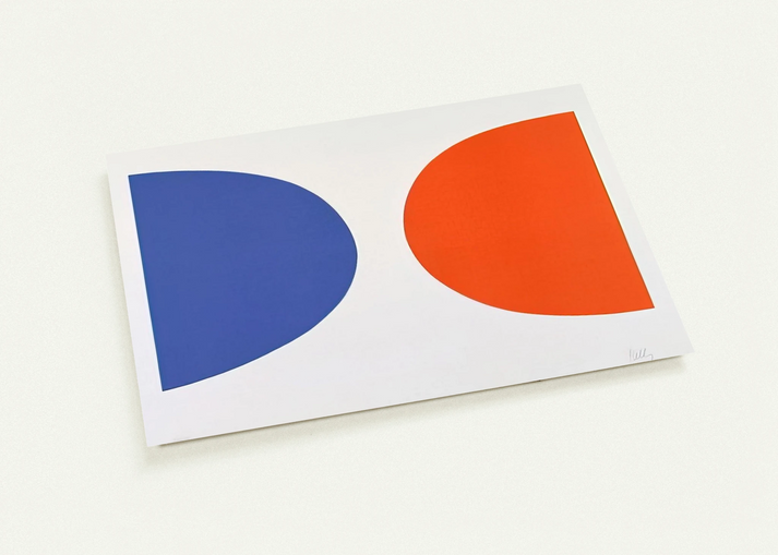
Blue and Orange from Suite of Twenty-Seven Color Lithographs By Ellsworth Kelly Pack of 10 Post Cards | Ellsworth Kelly Post Cards | A6 (10.5 x 14.8 cm) - 4.1 x 5.8 inches
Blue and Orange from Suite of Twenty-Seven Color Lithographs By Ellsworth Kelly Pack of 10 Post Cards | Ellsworth Kelly Post Cards | A6 (10.5 x 14.8 cm) - 4.1 x 5.8 inches
Couldn't load pickup availability
The Intersection of Form and Vibration: Ellsworth Kelly’s Blue and Orange
In the mid-1960s, Ellsworth Kelly revolutionized the language of abstraction with his seminal Suite of Twenty-Seven Color Lithographs. Among these, Blue and Orange stands as a masterclass in chromatic tension and geometric balance. By removing the visible hand of the artist and focusing on the pure relationship between saturated hues, Kelly invites the viewer to experience color as a physical presence. RedKalion is proud to present this iconic work as a pack of 10 museum-quality post cards, allowing you to share a piece of minimalist history with the world.
Museum-Quality Reproductions for the Modern Aesthetic
At RedKalion, we believe that fine art should be felt. These post cards are not mere stationery; they are miniature archival prints. Utilizing advanced 12-color fine art printing technology, we achieve a depth and vibrancy that standard 4-color commercial printing simply cannot replicate. The brilliant orange and deep blue of Kelly's vision are rendered with exacting precision on 200 gsm (80 lb) paper, ensuring a substantial feel and a smooth matte finish that eliminates glare and enhances the depth of the pigments.
The RedKalion Archival Standard
Every set is printed on demand, ensuring that your cards have not been sitting in a warehouse, but are freshly produced using FSC-certified, eco-friendly materials. Whether you are sending a thoughtful note or framing them as a curated series for a minimalist gallery wall, these prints embody the 'hard-edge' philosophy that made Kelly a titan of 20th-century art. Elevate your space and your correspondence with an archival masterpiece that endures.
- Artist: Ellsworth Kelly
- Collection: Suite of Twenty-Seven Color Lithographs (1964–65)
- Format: Flat post card, pack of 10
- Dimensions: A6 (10.5 x 14.8 cm / 4.1 x 5.8 inches)
- Paper Weight: 200 gsm (80 lb) with a 0.26 mm thickness
Discover Unlimited Art Possibilities
At RedKalion, you can find virtually any artwork from any artist, available in a wide range of sizes to perfectly match your space.
If you didn’t find what you’re looking for, contact us at support@redkalion.com . We will source any artwork and produce it in any size and format you need, including art prints, posters, canvas, framed pieces, framed canvas, and more.
For dedicated art enthusiasts, we also offer handcrafted replicas of any artwork, carefully painted by highly skilled artists using traditional techniques.
For custom requests, contact us at support@redkalion.com .
What makes the color quality of these post cards superior?
We use 12-color fine art printing technology, which provides a significantly wider color gamut and greater depth than standard 4-color printers, ensuring the 'Blue and Orange' hues are vibrant and museum-accurate.
What are the paper specifications for this Ellsworth Kelly set?
These cards are printed on 200 gsm (80 lb) paper with a thickness of 0.26 mm. The smooth matte finish provides a clean, glare-free display suitable for both writing and framing.
Are the materials used for these prints sustainable?
Yes, RedKalion prioritizes the environment. We use FSC-certified paper, which ensures the materials are sourced from responsibly managed forests that provide environmental, social, and economic benefits.
Can these post cards be framed as individual art pieces?
Absolutely. Given their 12-color archival printing and heavy 200 gsm weight, these A6 post cards function as high-quality miniature fine art prints, perfect for minimalist gallery walls.
What is the shipping and production process for these cards?
All our products are printed on demand to reduce waste. This ensures your Ellsworth Kelly post cards are freshly produced and inspected for quality before being shipped directly to you.
What is the historical significance of Kelly’s 'Suite of Twenty-Seven Color Lithographs'?
Published between 1964 and 1965, this suite represents Kelly’s exploration of 'perceptual abstraction,' where the artist used lithography to explore how isolated shapes and colors interact without the distraction of brushwork.
Why did Ellsworth Kelly use blue and orange specifically in this piece?
Kelly often utilized complementary colors to create 'vibration' at the edge where the colors meet. The contrast between the cool blue and warm orange creates a visual tension that defines his hard-edge style.