RedKalion
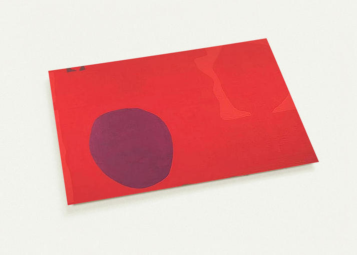
Cadmium with Violet, Scarlet, Emerald, Lemon and Venetian - 1969 By Patrick Heron Pack of 10 Post Cards | Patrick Heron Post Cards | A6 (10.5 x 14.8 cm) - 4.1 x 5.8 inches
Cadmium with Violet, Scarlet, Emerald, Lemon and Venetian - 1969 By Patrick Heron Pack of 10 Post Cards | Patrick Heron Post Cards | A6 (10.5 x 14.8 cm) - 4.1 x 5.8 inches
Couldn't load pickup availability
Elevate Your Correspondence with Patrick Heron’s Chromatic Mastery
Experience the vibrant legacy of the St Ives school with this exquisite pack of 10 post cards featuring Patrick Heron’s 1969 masterpiece, 'Cadmium with Violet, Scarlet, Emerald, Lemon and Venetian'. A central figure in 20th-century British abstraction, Heron’s work is a profound exploration of the relationship between color and space. This specific composition illustrates his shift toward soft-edged, saturated forms that seem to vibrate against one another, creating a visual rhythm that is both energetic and harmonious.
Museum-Quality Reproduction for Art Lovers
At RedKalion, we bridge the gap between historical art and modern curation. These are not standard stationery items; they are archival-grade reproductions. Utilizing our advanced 12-color fine art printing technology, we achieve a depth of color and accuracy that far exceeds conventional 4-color printing. Every nuance of the scarlet, the sharpness of the lemon, and the earthy depth of the Venetian red is captured with stunning fidelity.
Premium Material Specifications
- Format: Pack of 10 flat post cards, perfect for gifting or display.
- Size: A6 (10.5 x 14.8 cm | 4.1 x 5.8 inches).
- Paper Quality: 200 gsm (80 lb) heavy-weight paper with a thickness of 0.26 mm (10.3 mils).
- Finish: A smooth matte finish that eliminates glare, allowing the artwork to shine under any lighting.
- Sustainability: Printed on FSC-certified paper, ensuring an environmentally conscious purchase.
Whether you are sending a thoughtful note or framing them as a curated set of miniatures, these Patrick Heron post cards serve as a testament to archival quality and artistic excellence. Invest in a piece of art history that endures.

Discover Unlimited Art Possibilities
At RedKalion, you can find virtually any artwork from any artist, available in a wide range of sizes to perfectly match your space.
If you didn’t find what you’re looking for, contact us at support@redkalion.com . We will source any artwork and produce it in any size and format you need, including art prints, posters, canvas, framed pieces, framed canvas, and more.
For dedicated art enthusiasts, we also offer handcrafted replicas of any artwork, carefully painted by highly skilled artists using traditional techniques.
For custom requests, contact us at support@redkalion.com .
What defines the print quality of these Patrick Heron post cards?
We use professional 12-color fine art printing technology. This ensures superior color vibrancy and tonal depth compared to standard printing, accurately capturing Heron's complex palette of violets, scarlets, and emeralds.
What type of paper is used for this collection?
The cards are printed on premium 200 gsm (80 lb) paper with a smooth matte finish. At 0.26 mm thick, they offer a substantial, high-quality feel suitable for both mailing and framing.
Are these post cards environmentally friendly?
Yes. RedKalion is committed to sustainability; all post cards are printed on demand using FSC-certified paper, which supports responsible forestry practices and reduces unnecessary waste.
How long will the colors last on these reproductions?
Our archival-grade inks and FSC-certified matte paper are designed for longevity. These museum-quality prints are resistant to fading, ensuring the artwork remains vivid for years when kept out of direct sunlight.
When can I expect my order to arrive?
Each pack is printed on demand to ensure perfect quality. Orders are typically processed quickly and shipped with care to ensure they arrive in pristine condition, ready for your collection.
What was Patrick Heron's focus in 'Cadmium with Violet, Scarlet, Emerald, Lemon and Venetian'?
Heron was obsessed with the way different colors interact at their boundaries. In this 1969 work, he explored how saturated hues can create a sense of light and space without using traditional perspective.
Why are these specific colors significant in Heron's 1969 period?
By 1969, Heron moved toward 'wobbly' shapes and intense color fields. These specific pigments—like Cadmium and Venetian red—were chosen for their unique weight and how they visually advance or recede.