RedKalion
GREY ALPHABETS - Jasper Johns Acrylic Print - 70x100 cm / 28x40″ inches
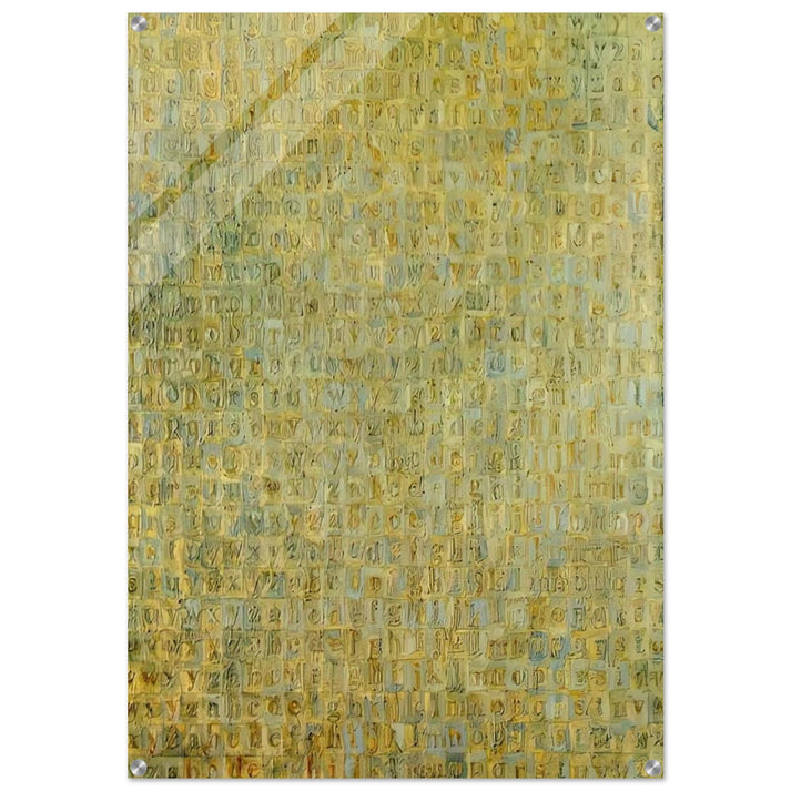
GREY ALPHABETS - Jasper Johns Acrylic Print - 70x100 cm / 28x40″ inches
Couldn't load pickup availability
Grey Alphabets by Jasper Johns: A Modernist Icon in Premium Acrylic
Experience the bold, graphic power of Jasper Johns' Grey Alphabets in this museum-quality acrylic print from RedKalion. This 70x100 cm (28x40″) reproduction captures every nuance of Johns' groundbreaking 1956 work, where he transformed the familiar alphabet into a profound exploration of language, perception, and abstraction. As a leading figure in the Neo-Dada and Pop Art movements, Johns challenged artistic conventions by elevating everyday symbols—like letters and numbers—into high art. Our archival-grade print preserves the subtle tonal variations and textured brushwork of the original, rendered in sleek 4mm (0.15") acrylic for a vibrant, gallery-ready display that resists fading and wear.
This piece is more than decor; it's a statement of intellectual sophistication. The straight-cut corners and clean lines complement the minimalist aesthetic, while the transparent background defaults to white to enhance contrast and visual impact. Perfect for modern interiors, corporate spaces, or art collections, it invites contemplation on the interplay between form and meaning. RedKalion ensures every detail—from the precise color matching to the durable acrylic surface—meets the highest standards of fine art reproduction.
- Dimensions: 70x100 cm / 28x40″ inches
- Material: 4mm (0.15") acrylic for a sleek, vibrant, and durable finish
- Design: Straight-cut corners for a modern look; transparent backgrounds default to white
- Hanging Kit: Includes hardware, screws, and screw holes at each corner (14mm (0.55") from the edge, with an 8mm (0.31") diameter hole and 15mm (0.6") screw head)
Elevate your space with an archival masterpiece that endures, backed by RedKalion's expertise in curating world-class reproductions for discerning collectors.

Discover Unlimited Art Possibilities
At RedKalion, you can find virtually any artwork from any artist, available in a wide range of sizes to perfectly match your space.
If you didn’t find what you’re looking for, contact us at support@redkalion.com . We will source any artwork and produce it in any size and format you need, including art prints, posters, canvas, framed pieces, framed canvas, and more.
For dedicated art enthusiasts, we also offer handcrafted replicas of any artwork, carefully painted by highly skilled artists using traditional techniques.
For custom requests, contact us at support@redkalion.com .
What is the historical significance of Jasper Johns' Grey Alphabets?
Created in 1956, Grey Alphabets is a seminal work where Jasper Johns deconstructed the alphabet into abstract forms, blending Neo-Dada and early Pop Art to challenge perceptions of language and art, making it a key piece for modern art enthusiasts and collectors.
How does the acrylic print enhance the artwork's details?
The 4mm (0.15") acrylic surface provides a sleek, vibrant finish that amplifies the tonal depth and brushwork of Johns' original, offering a durable, museum-quality reproduction ideal for high-end fine art prints in home or office settings.
What are the specifications for hanging this acrylic print?
It includes a full hanging kit with hardware, screws, and pre-drilled screw holes at each corner—14mm (0.55") from the edge, with an 8mm (0.31") diameter hole and 15mm (0.6") screw head—for easy, secure installation on any wall.
How does RedKalion ensure the print's archival quality?
We use premium materials and precise color matching to create archival-grade reproductions that resist fading, ensuring your Grey Alphabets acrylic print remains vibrant and durable as a long-lasting art investment.
What is the shipping and delivery process for this item?
RedKalion ships worldwide with careful packaging to protect the acrylic print; delivery times vary by location, and tracking is provided for a secure, reliable fine art print purchase experience.
Why did Jasper Johns use grey tones in this artwork?
Johns employed grey to neutralize the alphabet's symbolic associations, focusing viewers on form and texture rather than color, reflecting his interest in ambiguity and the mundane transformed into art.
How does the straight-cut corner design affect the display?
The straight-cut corners create a modern, clean aesthetic that complements the artwork's minimalist style, enhancing its visual impact in contemporary interiors without distracting from the Grey Alphabets' graphic power.