
RedKalion
Victor Pasmore - Harmony of Opposites - 1986 75x100 cm / 30x40inches Fine Art Poster
Victor Pasmore - Harmony of Opposites - 1986 75x100 cm / 30x40inches Fine Art Poster
Couldn't load pickup availability
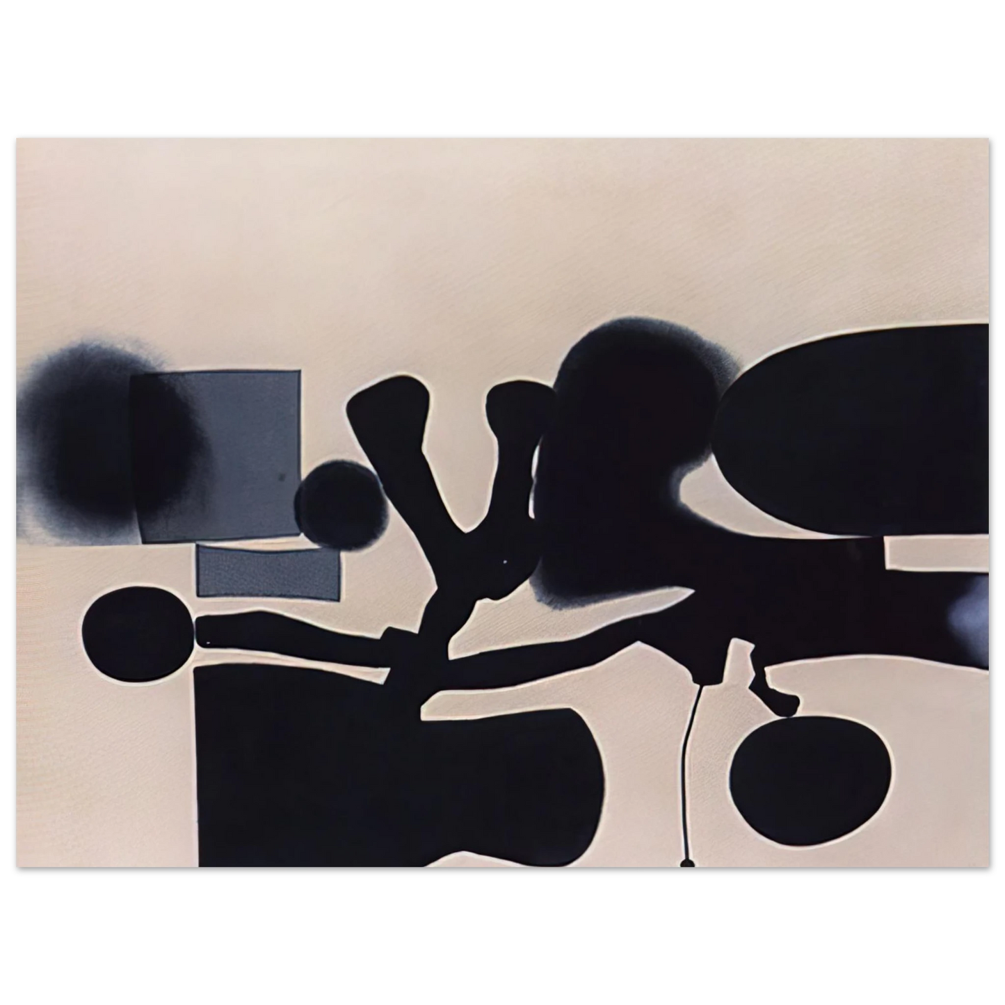
Victor Pasmore - Harmony of Opposites - 1986
Immerse yourself in the abstract brilliance of Victor Pasmore with this museum-quality fine art print of Harmony of Opposites, created in 1986. Measuring 75x100 cm (30x40 inches), this piece exemplifies Pasmore's late-career mastery, where geometric forms and organic lines converge to explore balance and contrast. As a leading figure in British abstract art, Pasmore's work from this period reflects his deep engagement with Constructivist principles, offering a visual dialogue that is both intellectually stimulating and aesthetically serene. This archival reproduction captures every nuance of the original, from the subtle interplay of shapes to the restrained color palette, making it an ideal centerpiece for modern interiors seeking sophistication and depth.
RedKalion presents this fine art poster on our exclusive Master's Edition archival paper, ensuring a premium, gallery-worthy display. The matte, uncoated finish in a natural white hue enhances the artwork's texture and luminosity, while the 250 gsm (110 lb) weight and 0.29 mm thickness provide a substantial, durable feel. Crafted from acid-free, FSC-certified materials, this print is designed to resist yellowing and maintain its vibrancy for generations, embodying our commitment to sustainability and enduring quality. Printed and shipped on demand with no minimum orders, it offers a seamless way to elevate your space with a timeless masterpiece.
- Dimensions: 75x100 cm / 30x40 inches
- Paper: Master's Edition archival paper, museum-quality
- Finish: Matte, uncoated, natural white (off-white)
- Longevity: Acid-free (pH above 7) to prevent yellowing
- Weight & Thickness: 250 gsm (110 lb), 0.29 mm (11.4 mils)
- Sustainability: FSC-certified paper
- Fulfillment: Printed and shipped on demand, no minimum orders
Elevate your environment with an archival reproduction that bridges art history and contemporary design, curated by RedKalion for discerning collectors.
Discover Unlimited Art Possibilities
At RedKalion, you can find virtually any artwork from any artist, available in a wide range of sizes to perfectly match your space.
If you didn’t find what you’re looking for, contact us at support@redkalion.com . We will source any artwork and produce it in any size and format you need, including art prints, posters, canvas, framed pieces, framed canvas, and more.
For dedicated art enthusiasts, we also offer handcrafted replicas of any artwork, carefully painted by highly skilled artists using traditional techniques.
For custom requests, contact us at support@redkalion.com .
What are the dimensions of this Victor Pasmore fine art print?
This museum-quality reproduction measures 75x100 cm (30x40 inches), ideal for standard framing and creating a striking visual impact in any room.
What type of paper is used for this archival print?
It is printed on Master's Edition archival paper, featuring a matte, uncoated finish in natural white for a luxurious texture and long-lasting vibrancy.
How durable is this fine art poster against aging?
Crafted from acid-free paper with a pH above 7, it resists yellowing over time, ensuring your print remains vibrant for generations as a premium art investment.
What is the weight and thickness of the paper?
The paper is 250 gsm (110 lb) with a thickness of 0.29 mm (11.4 mils), offering a substantial, high-quality feel suitable for museum displays.
Is this print environmentally sustainable?
Yes, it uses FSC-certified paper, reflecting RedKalion's commitment to eco-friendly practices in producing fine art reproductions.
What is the historical significance of 'Harmony of Opposites' by Victor Pasmore?
Created in 1986, this work showcases Pasmore's late abstract period, blending geometric and organic elements to explore Constructivist themes of balance and contrast in British art.
How does the matte finish enhance this artwork?
The matte, uncoated finish reduces glare and highlights the texture, allowing the subtle details of Pasmore's composition to shine in a natural, gallery-style presentation.