
What printing process is used for these Edward Ruscha postcards?
We use 12-color fine art printing technology. This advanced method provides superior color vibrancy and depth compared to standard 4-color prints, ensuring the nuances of Ruscha’s original 1969 work are accurately preserved.
What are the specific paper qualities of this set?
The postcards are printed on 200 gsm (80 lb) paper with a 0.26 mm thickness. They feature a smooth matte finish, providing a clean, glare-free surface that is ideal for both writing and display.
Are these postcards environmentally friendly?
Yes. All RedKalion prints are produced on FSC-certified paper, ensuring the materials are sourced from responsibly managed forests that provide environmental, social, and economic benefits.
How does RedKalion ensure color accuracy for the Adios print?
By utilizing a 12-color gamut, we achieve precise color matching. This is essential for Edward Ruscha’s work, where the subtle play between the typography and the background requires high-fidelity reproduction.
What is the shipping and order minimum for these prints?
These postcards are printed on demand with no minimum order requirements. This allows us to maintain high quality control while reducing waste by only producing what is requested.
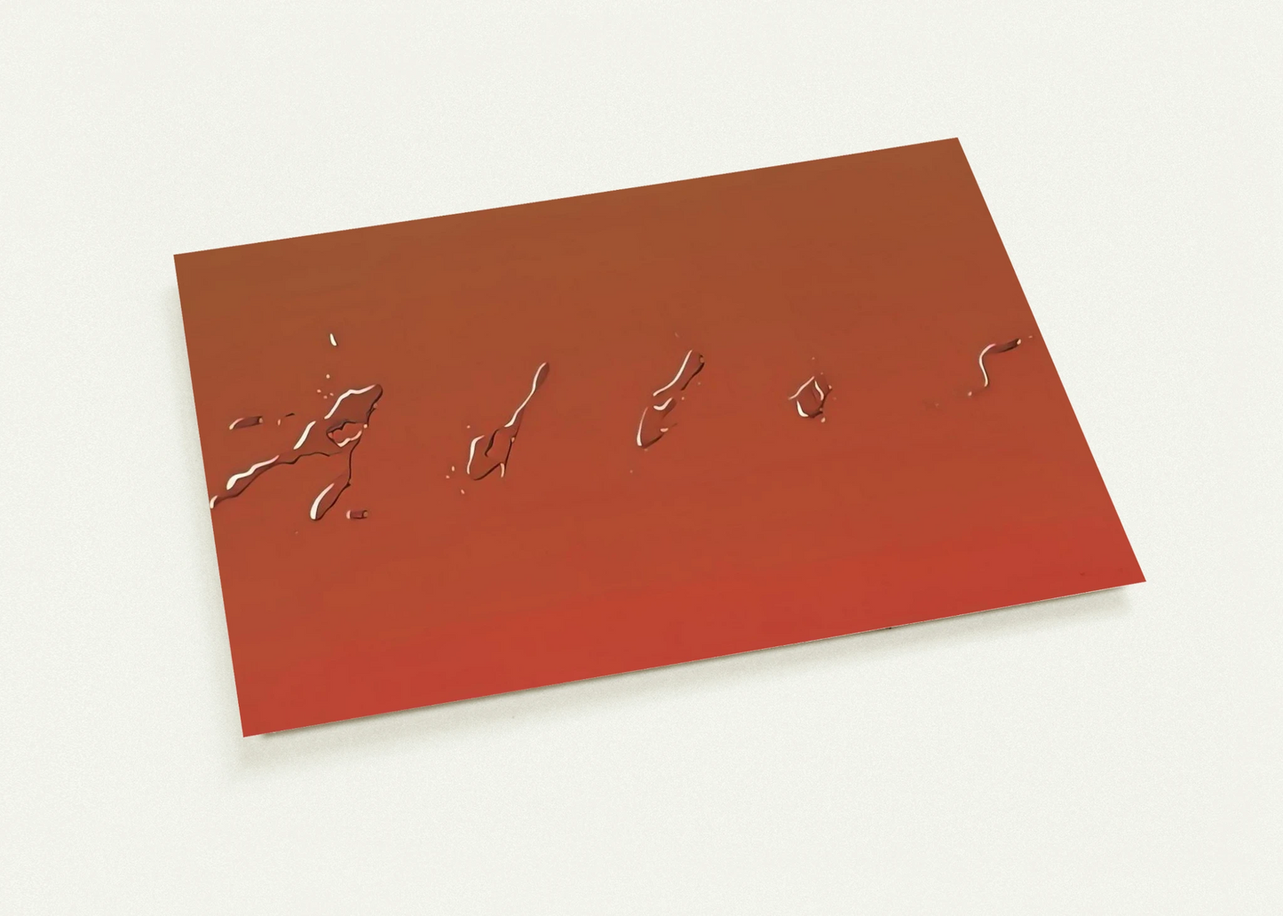
What is the significance of the liquid typography in Ruscha's Adios (1969)?
Ruscha’s 'liquid' style represents a shift toward Conceptual Art. By depicting words as physical substances (like spilled syrup or water), he challenges the viewer to see language as a visual object rather than just a carrier of meaning.
Is Adios (1969) considered Pop Art or Conceptual Art?
It sits at the intersection of both. While its bold, graphic nature aligns with Pop Art aesthetics, its focus on the semiotics of language and the deconstruction of words is a hallmark of Conceptualism.